HTML full screen layout
Having more of a WPF background, it’s hard for me to understand why in HTML/CSS it’s so difficult to create full-screen UIs. In WPF, with a relative small number of layouts, it’s easy to arrange and align anything anywhere. Align a panel to the bottom of the screen, centering panels inside other panels or overlapping panels is easy to implement and easy to understand.
Creating full-screen UIs in HTML has always been complicated. But the show continues even today when IE is just a medieval story and there are different systems (flexbox, grid) that are supposed to make things easier.
Seasoned HTML designers argue that it’s not hard to create these layouts, but rather people complaining simply don’t understand well enough how CSS works. That’s were I have to disagree: it’s not just that it’s hard to use, but rather it’s unintuitively designed. When you have a parent-child relation between two panels, the way they align is driven not only by the attributes set directly on them, but also on other controls (siblings of the child, or even worse totally unrelated controls).
This make creating UIs in HTML so much more complicated than in WPF (or even in Android…). In fact, it is so complicated that it has got the unofficial (but well deserved) name of the Holy Grail layout. And even if you succeed doing this Holy Grail by carefully (and frustrating) setting style attributes on different divs, good luck hosting a Holy Grail inside a Holy Grail layout.
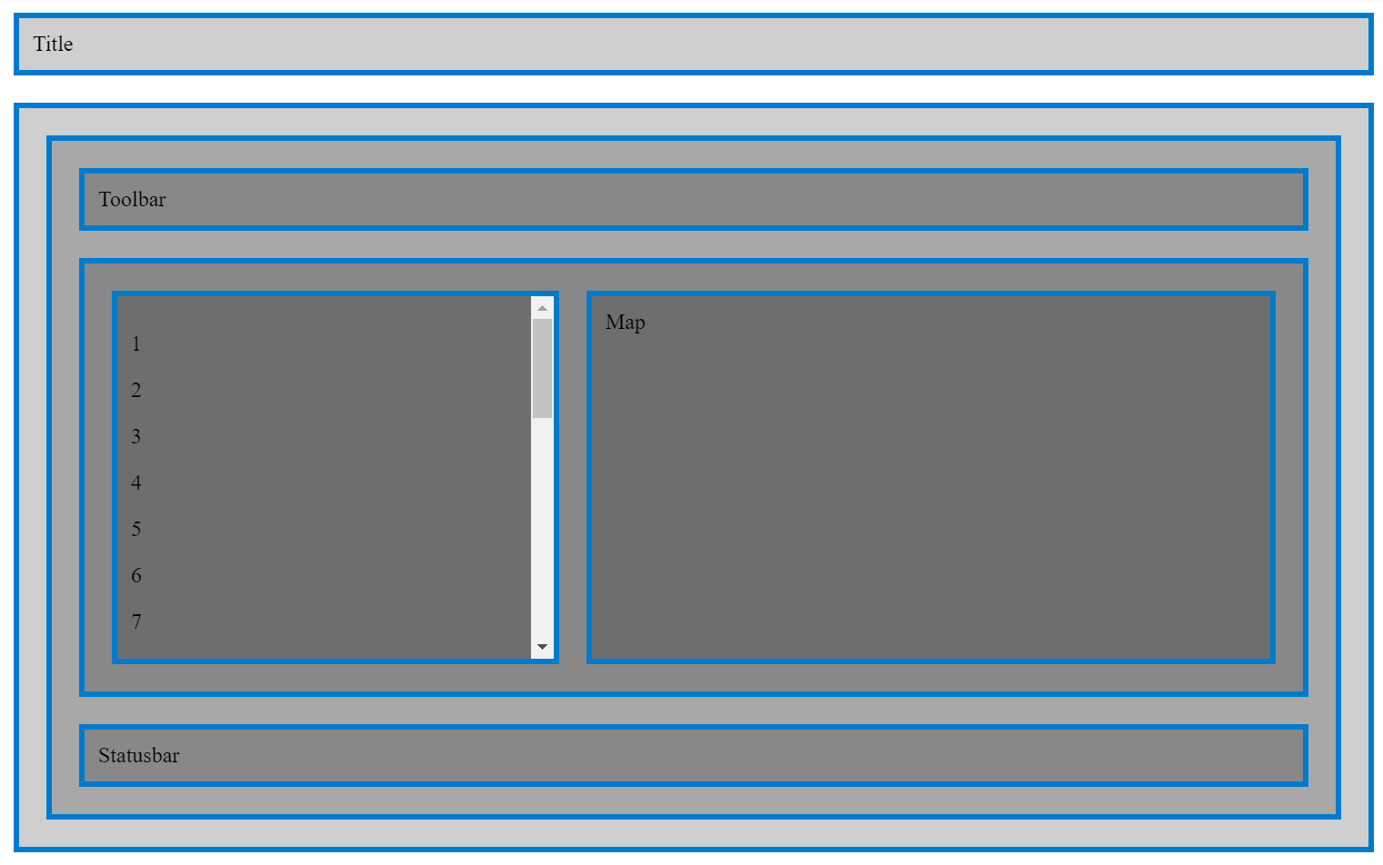
The concrete case I was working on, was a (simple) Google maps style layout like this:

Of course, I didn’t wanted to hardcode any heights or widths or magins, the title bar, toolbar and status bar should resize themselves to their content. And the left side panel, I wanted to have the scroll inside it not on the right of the page.
Here’s the html for the above layout:
<div class="main">
  <div class="main-title">Title</div>
  <div class="main-content">

    <div class="content">
      <div class="content-toolbar">Toolbar</div>
      <div class="content-middle">
        <div class="content-middle-sidebar">
          <p>1</p><p>2</p><p>3</p><p>4</p><p>5</p><p>6</p>
          <p>7</p><p>8</p><p>9</p><p>A</p><p>B</p><p>C</p>
          <p>D</p><p>E</p><p>F</p><p>G</p><p>H</p><p>I</p>
          <p>J</p><p>K</p><p>L</p><p>M</p><p>N</p><p>O</p>
        </div>
        <div class="content-middle-map">Map</div>
      </div>
      <div class="content-toolbar">Statusbar</div>
    </div>

  </div>
</div>
and the CSS:
html, body, .main {
    height: 100%;
    margin: 0;
}

.main {
  display: flex;
  flex-direction: column;
}

.main-title {
}

.main-content {
  flex: 0 1 100%;
  display: flex;
  flex-direction: column;
  overflow: auto;
}

.content {
  display: flex;
  flex-direction: column;
  flex: 0 1 100%;
  overflow: auto;
}

.content-toolbar {
}

.content-middle {
  flex: 0 1 100%;
  overflow: auto;
}

.content-middle {
  display: flex;
  flex-direction: row;
}

.content-middle-sidebar {
  flex: 0 0 300px;
  background: #00000066;
  overflow: auto;
}

.content-middle-map {
  flex: 1;
}


.main-title, .main-content,
.content, .content-toolbar, .content-middle,
.content-middle-sidebar, .content-middle-map {
  background: #00000030;
  border: 4px solid #007ACC;
  margin: 10px;
  padding: 10px;
}
This is the simplest form I could get with.
I’m putting these here because I’m very sure I’m going to need them at some point in the future 🙂. Also available for jamming on codepen.io.
Enjoy Reading This Article?
Here are some more articles you might like to read next: